The Content Explorer is the master content view for managing content in the pro client content system. It delivers a folder and item interface similar to the Windows Explorer tool - allowing users to organize and manage their content and folders. The Explorer is just one of the ways of viewing content in the content manager toolset - however, it has the richest functionality.
The Explorer is usually the default view presented to users when there are no favorites or recent items. This can be configured in the user defaults section.
Explorer Workspace
The third icon in the content manager takes users into the Content Explorer view (orange arrow below):
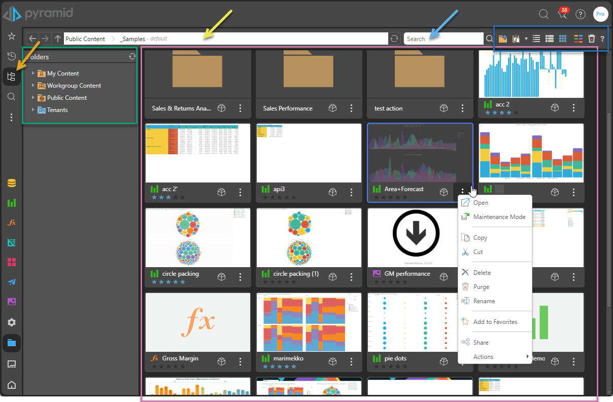
Item listing
The "item listing" (purple box above) is visible in every content view, not just the explorer. It shows a list of content items that match the selections, search, filters, and so on selected on the page. The listing contains files of all of the content types (associated with the apps: Model, Discover, Formulate, Tabulate, Present, Publish, and Illustrate), and also sub-folders, which are contained within the selected parent folder.
For information about how you manage the items in this view, see Item Mechanics.
Folder Tree
The folder tree (green box) shows the core domains accessible to all users on the platform:
- My Content - A personal domain of content accessible only to the logged in user.
- Workgroup Content - A domain of content accessible to all users who have COMMON roles in the system. In effect, there is a workgroup folder for each role, with each member of that role having read-write access to content. This is perfect for informal content sharing.
- Public Content - A shared content domain that is accessible to users and roles based on a SPECIFIC role assignments by folder and content item.
Shared Items
When a Sender invites you to share an artifact, it is typically "copied" to your Shared Items folder. This folder is located under My Content and visible in your Favorites folder by default.
- Click here for more information about sharing and your Shared Items folder
Admin Access
Admins on the system have access to another folder domain Team Member Content - this is broken down into tenants and users, and allows admins to access each user's private content domain.
Folder Domain Settings
Beyond the standard functionality of the folder structures, admins can also tweak the way they operate across the system using these switches:
- Multitenancy: these switches, including cross-tenant access, control how tenants operate and which folders are presented to users.
- Disabling top-level folder creation: another set of switches to prevent normal users from creating top-level folders
- Blocking Role Specific Workgroup Folders: a switch to prevent a new workgroup folder for each created role.
- Blocking the Workgroup domain for a tenant: a switch to hide the entire workgroup option by tenant.
- Click here for more details about the folder tree structures.
Using the Folder Tree
The folder tree is used as a classic organization tool - and users can copy / paste, cut / paste, delete, secure, and export folders as described in more detail here.
Navigation Bar
The top navigation bar, which can be seen in various forms across most content views, is comprised of three sections in the explorer view (left to right):
Folder Navigation and Breadcrumbs
The folder navigation bar shows the folder you are currently in. It acts as a Breadcrumb trail, allowing you to click on a segment in the trail to jump to a previous folder in the tree. There are also navigation buttons (Up, Left , and Right) that allow you to navigate the tree exactly as you would in any explorer tool (for example, Windows Explorer):
- Back and Forward: Go back and forward to previously selected folders.
- Up: Go up the folder tree structure to the current folder's parent folder.
Quick Search
Quick search (Magnifier icon) lets the user search for items by their name or description within the context of the current selection. For example, in the Content Explorer view this means within the current folder and its sub-folders.
Switches
For each view, the user has access to certain switches (blue box above). This includes:
Add Folder
Content Explorer only. Add a new sub-folder to the currently selected folder. You can only use this option in folders where you have write access.
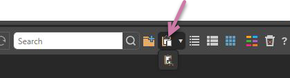
Paste clipboard item
If you currently have a cut or copied item on your clipboard, the Paste option (purple arrow below) is shown in the Navigation Bar:
Navigate to the folder that you'd like to paste your item to and do one of the following:
- Click Paste to paste the copied or cut item into the new location.
- Click Paste > Deep Paste from the dropdown list. Your selected item and the entire tree of items beneath your selected item are pasted into the new location.
Note: This option will be disabled in locations where pasting is not supported.
- Click here for more information about Pasting
View (Display Mode)
Set the appearance of the content items in this view by choosing a display mode or "view" from the following options:
- Detail List: A grid-like display of content items with various details.
- Content List: Like the detail list but with a snapshot (or thumbnail) for each item.
- Tile List: All the content items as large tiles, with each including a thumbnail.
Content Type Filter
Filter the types of content items in a given view that will be shown in the list. For example, if you clear the Unselect All checkbox and then select the Discovery checkbox, only discoveries are shown.
Show Deleted Items
Content Explorer only. Show soft-deleted items, so that they can be managed and potentially restored.
Explorer Functions and Actions
The explorer functions are split between those affecting the folder tree (green box) and those affecting the items (purple box). In some cases, there are common actions between these two elements while there are also similar actions that behave differently depending on whether the target is a folder or content item. Finally, many of the actions can be accessed from multiple content views in the content manager and are not exclusive to the explorer view.
- Click here for more details about folder related actions and tools.
- Click here for more details about content item related actions and tools.
- Click here for more details about actions and tools on the background context menu.
Item Mechanics
Once items are selected, the various context menus and tools are exposed. This can be done on a single item or on multiple items as a collection - including folders. For more details about the item mechanics in the content manager and the different content views, see Content Item Mechanics.